Popular
All Alphabet & Letter Stencils
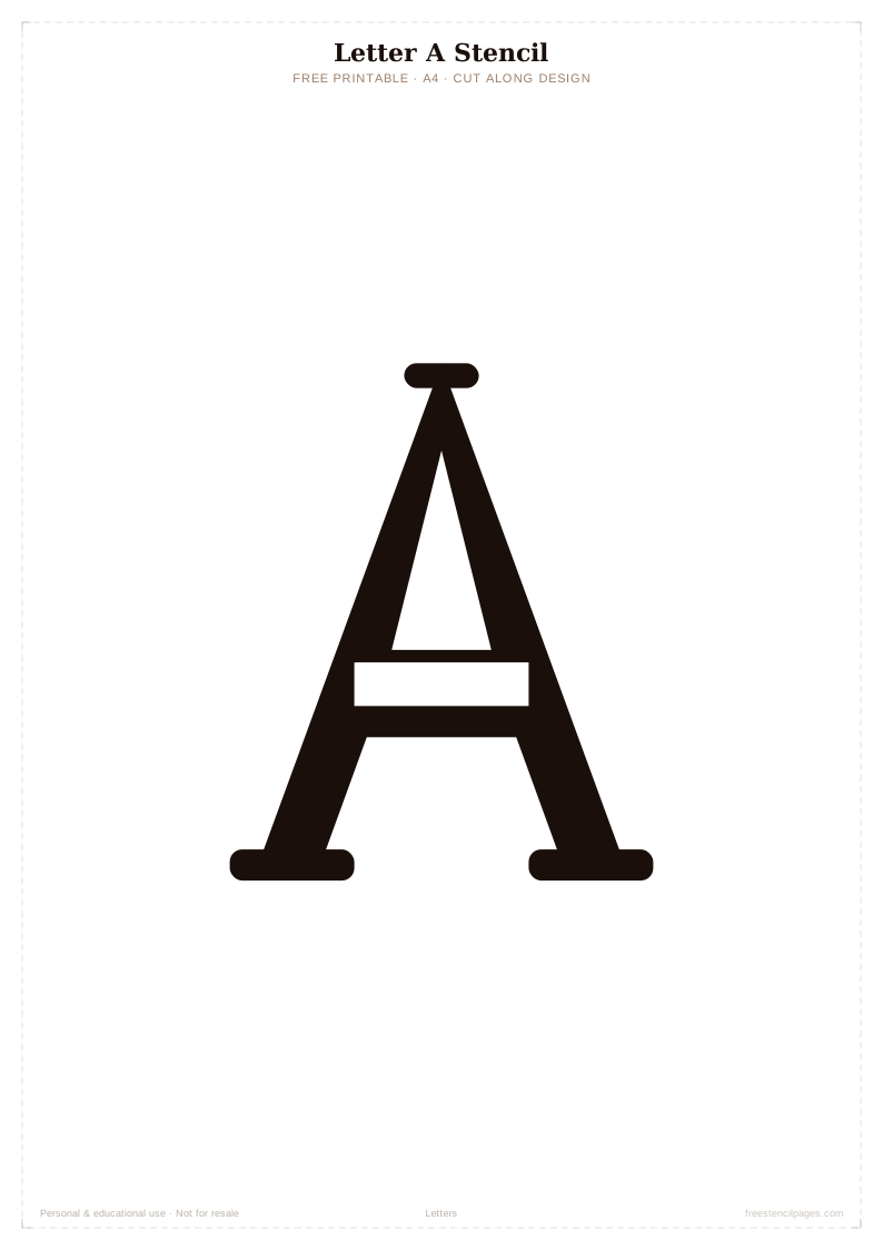
New
Letter B
⬇ Download Free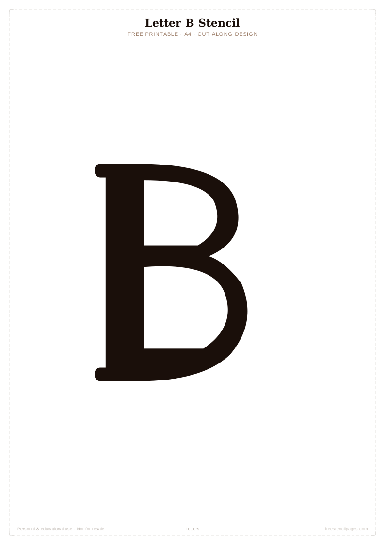
Classic
Letter C
⬇ Download Free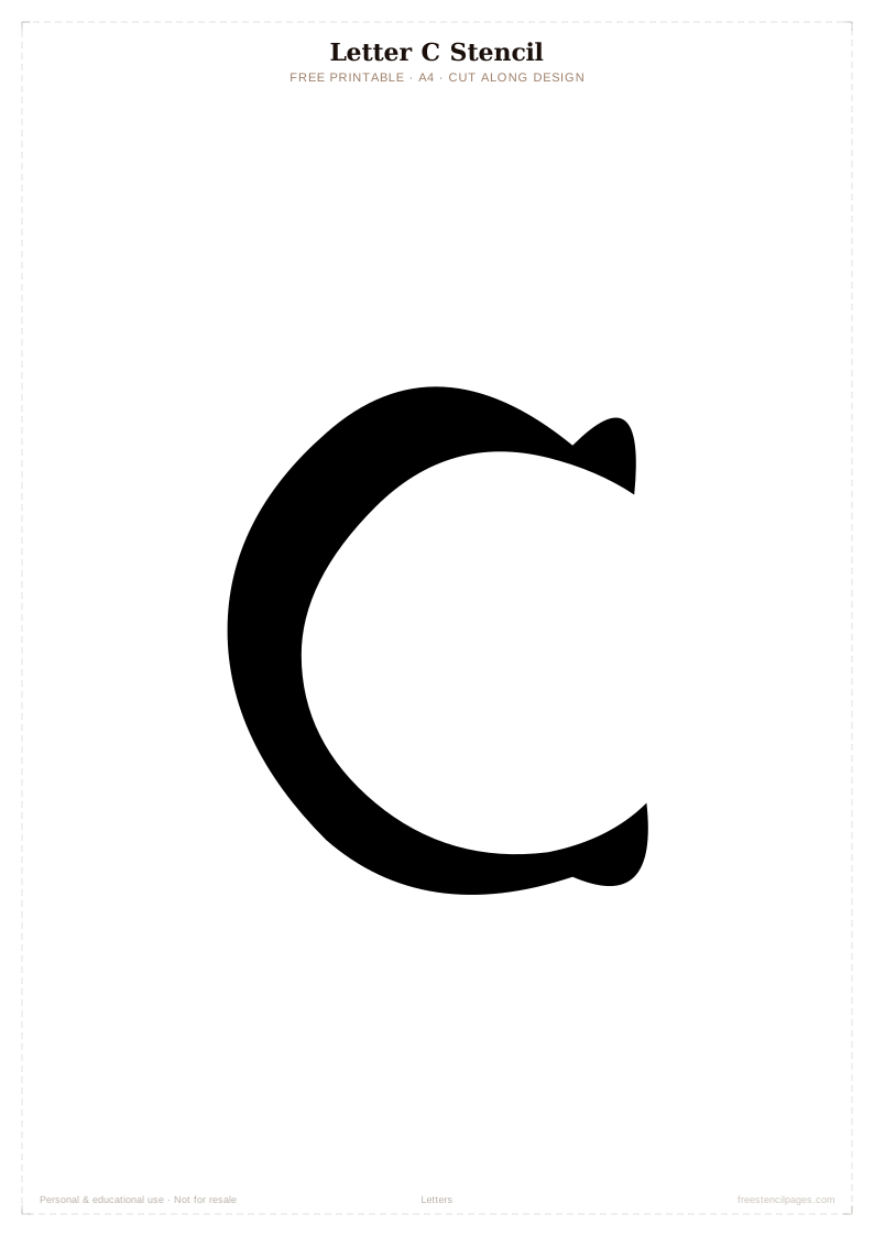
Featured
Letter D
⬇ Download Free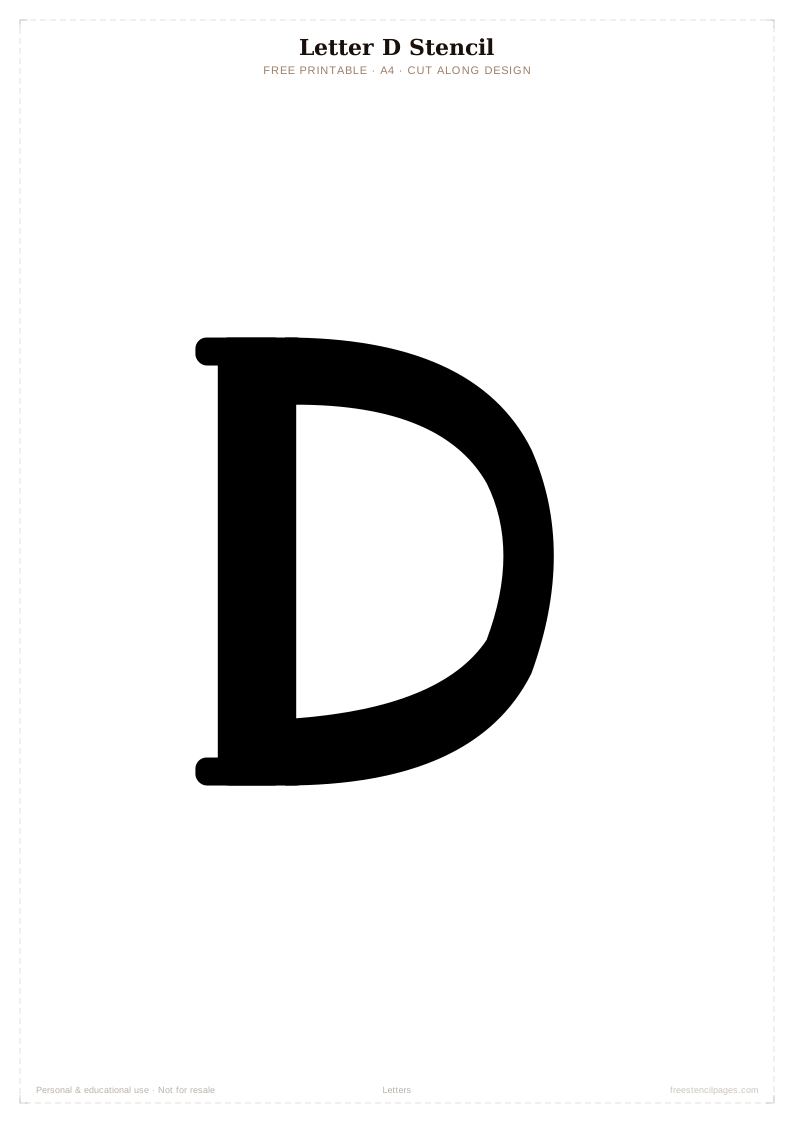
Top Pick
Letter E
⬇ Download Free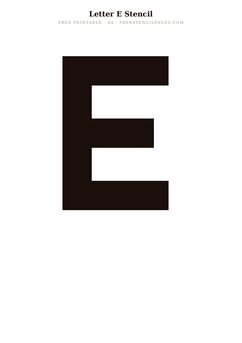
Trending
Letter F
⬇ Download Free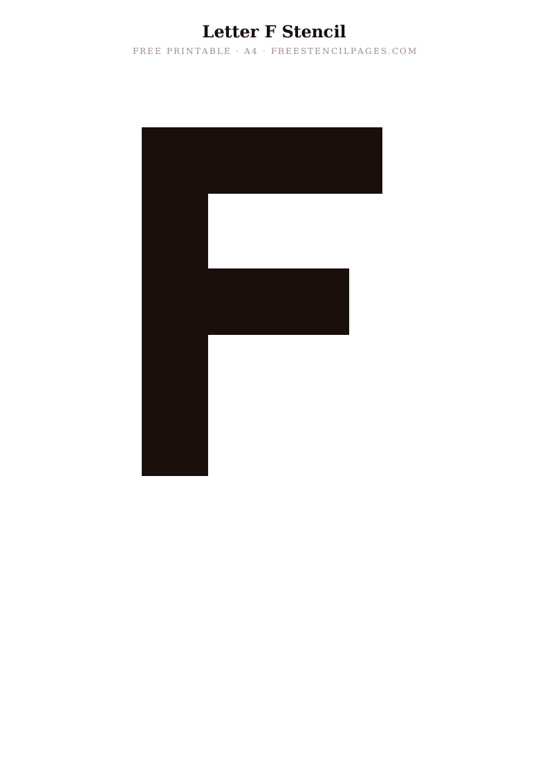
Staff Pick
Letter G
⬇ Download Free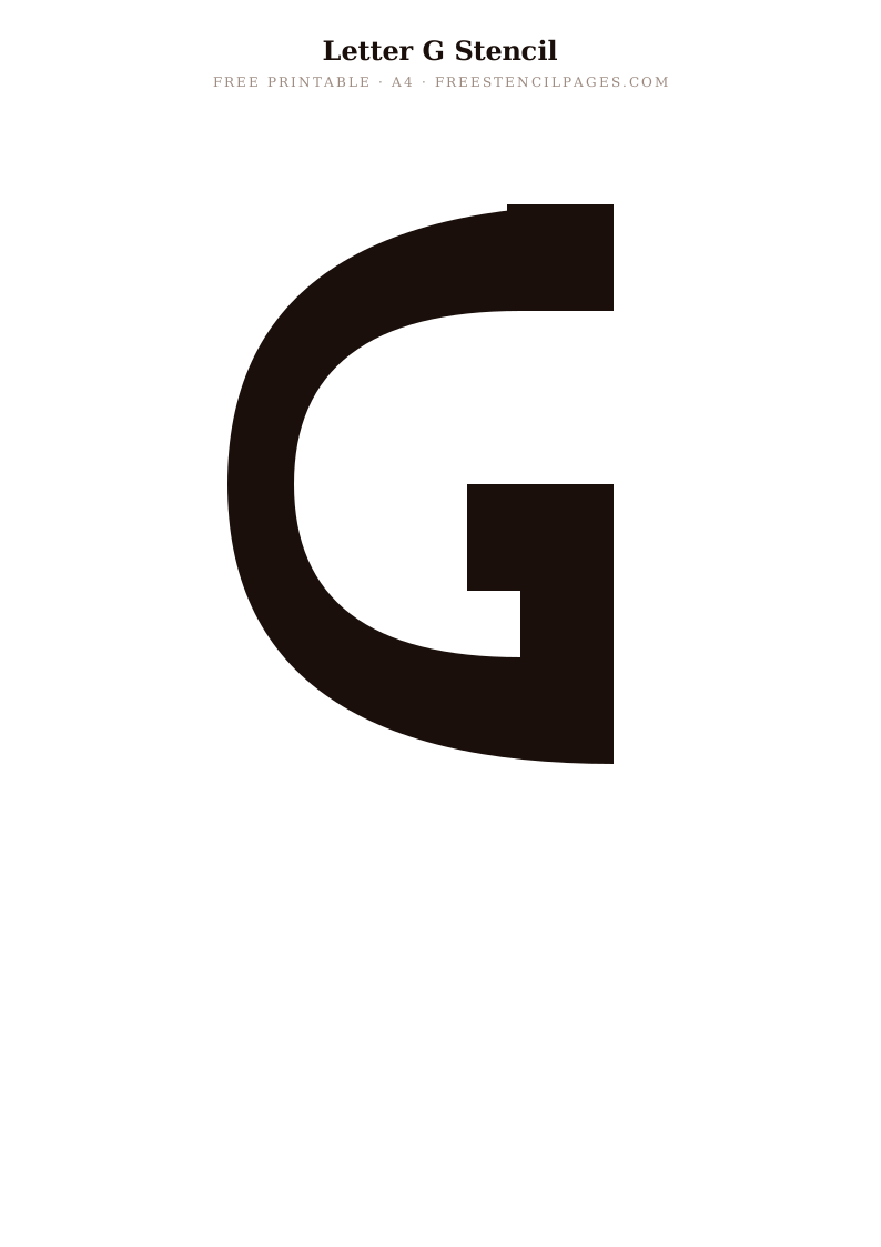
Popular
Letter H
⬇ Download Free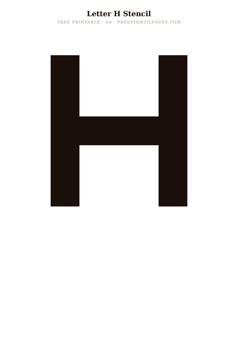
New
Letter I
⬇ Download Free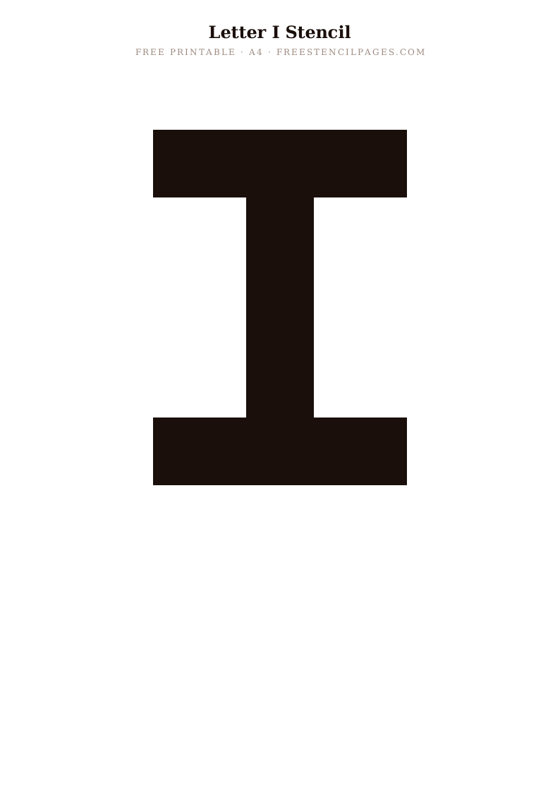
Classic
Letter J
⬇ Download Free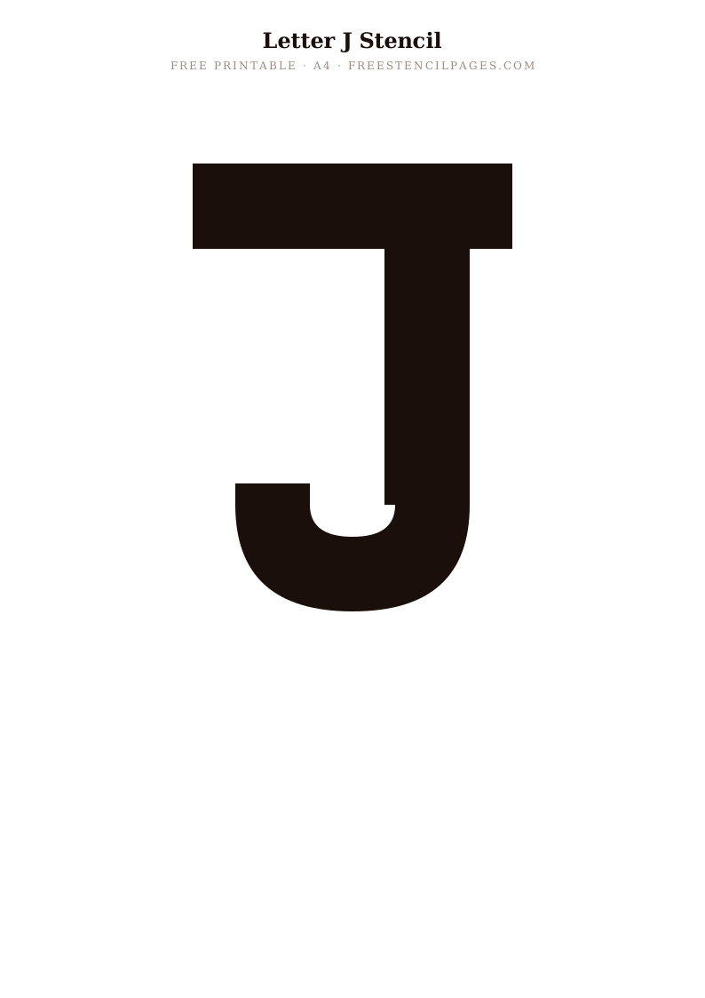
Trending
Letter K
⬇ Download Free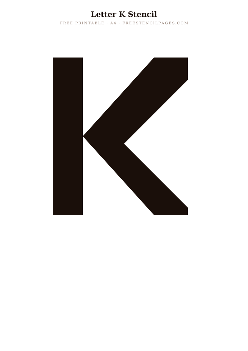
Featured
Letter L
⬇ Download Free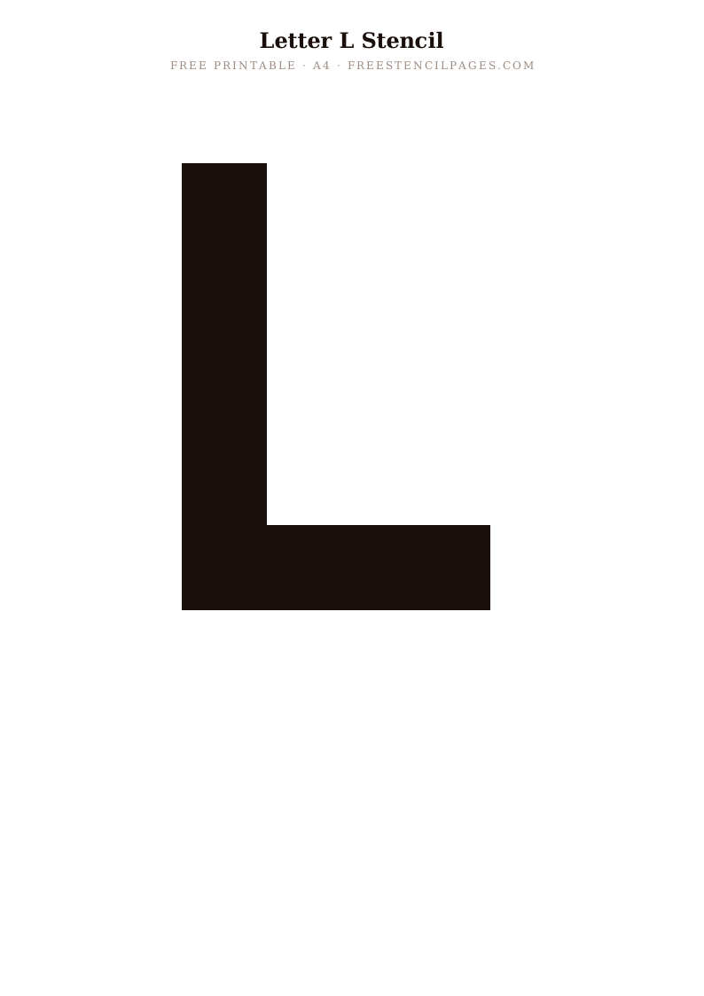
New
Letter M
⬇ Download Free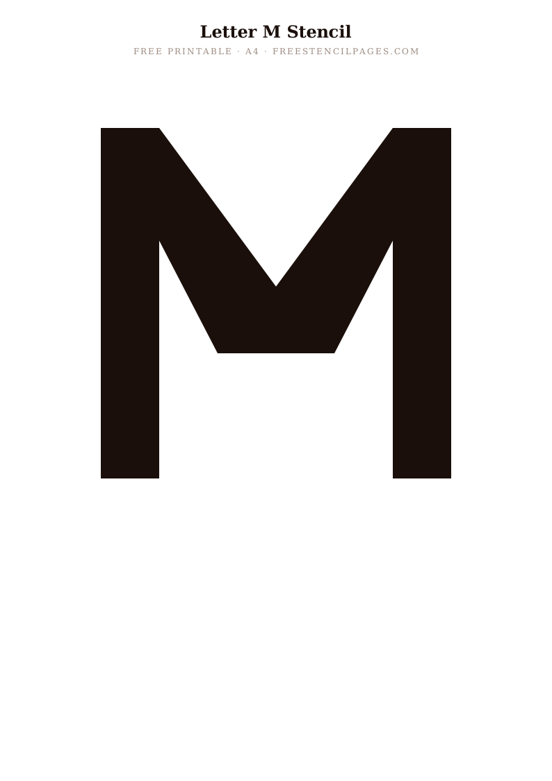
Popular
Letter N
⬇ Download Free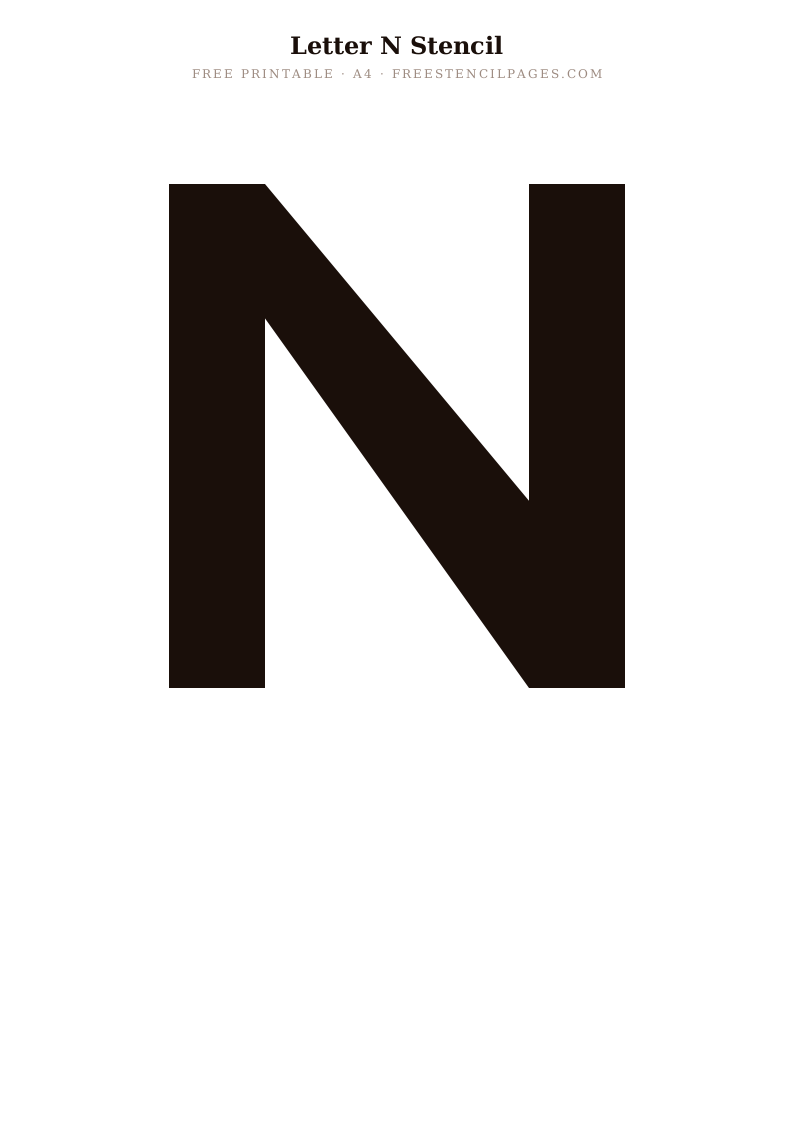
Classic
Letter O
⬇ Download Free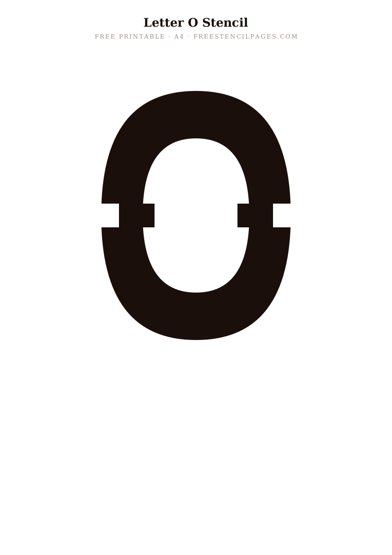
Featured
Letter P
⬇ Download Free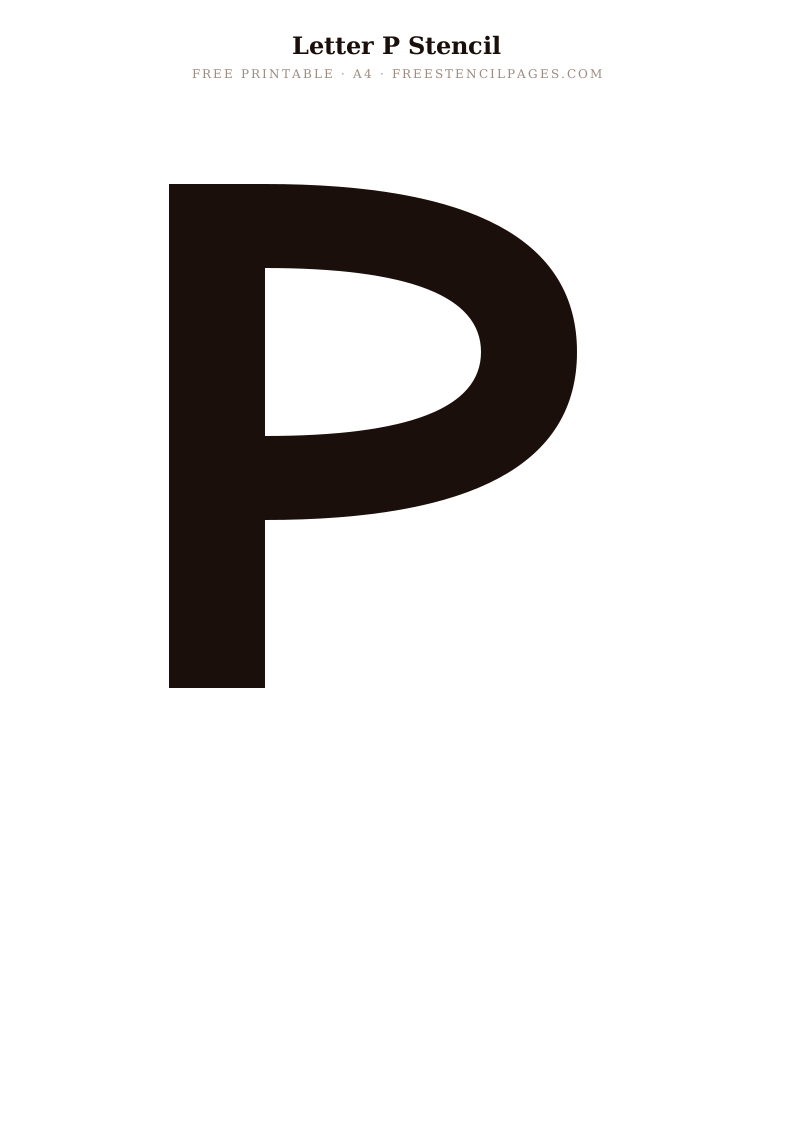
Top Pick
Letter Q
⬇ Download Free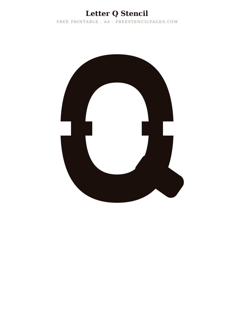
Staff Pick
Letter R
⬇ Download Free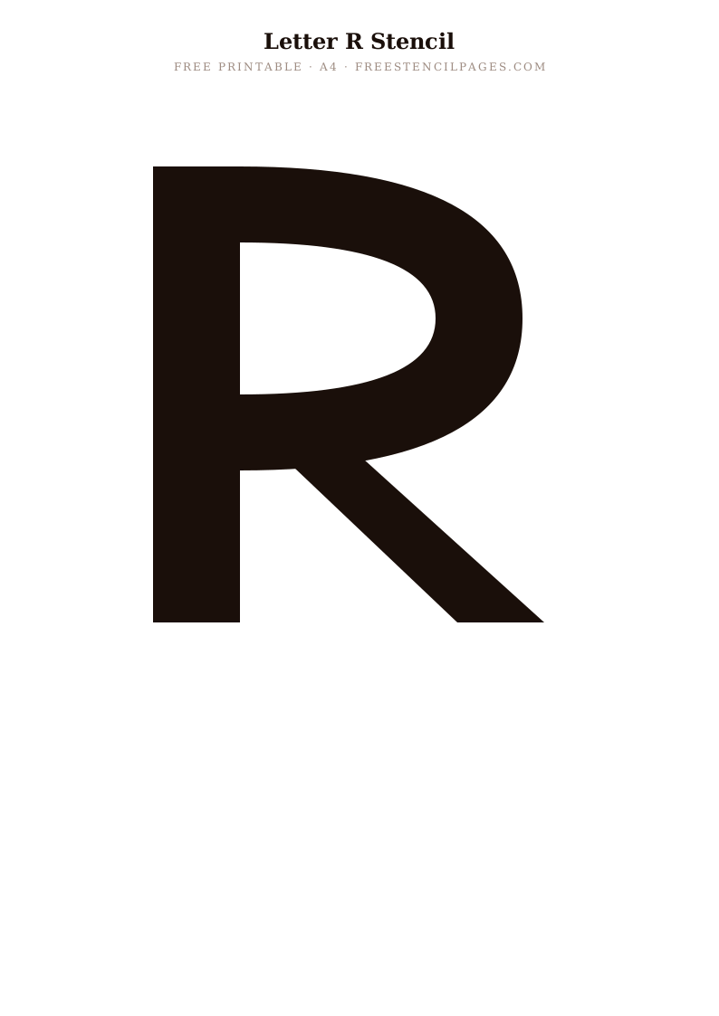
Popular
Letter S
⬇ Download Free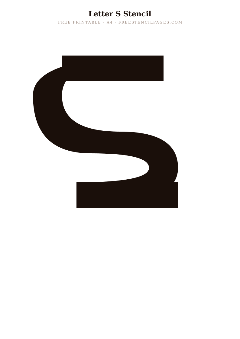
New
Letter T
⬇ Download Free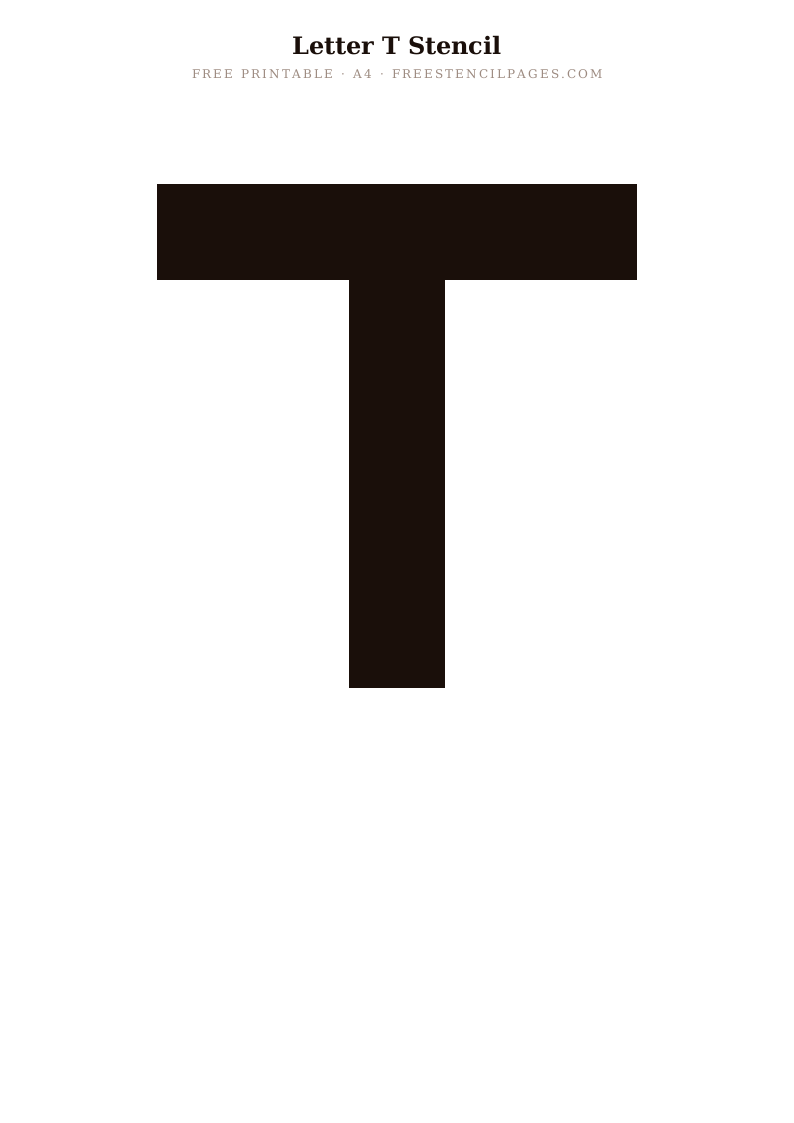
Classic
Letter U
⬇ Download Free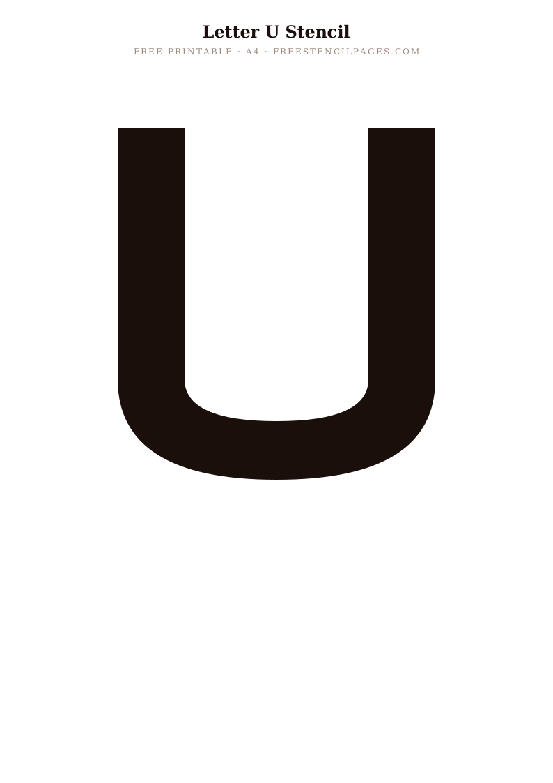
Featured
Letter V
⬇ Download Free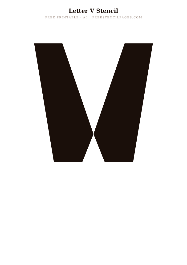
Trending
Letter W
⬇ Download Free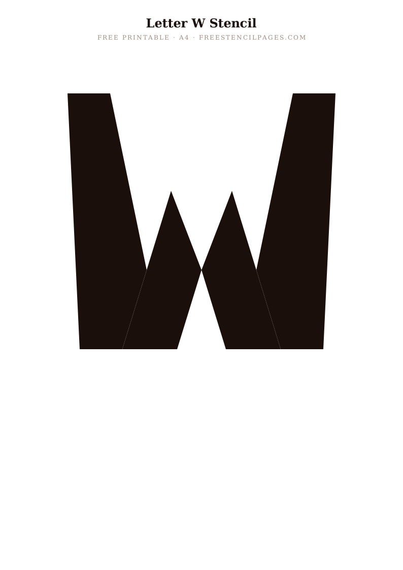
Staff Pick
Letter X
⬇ Download Free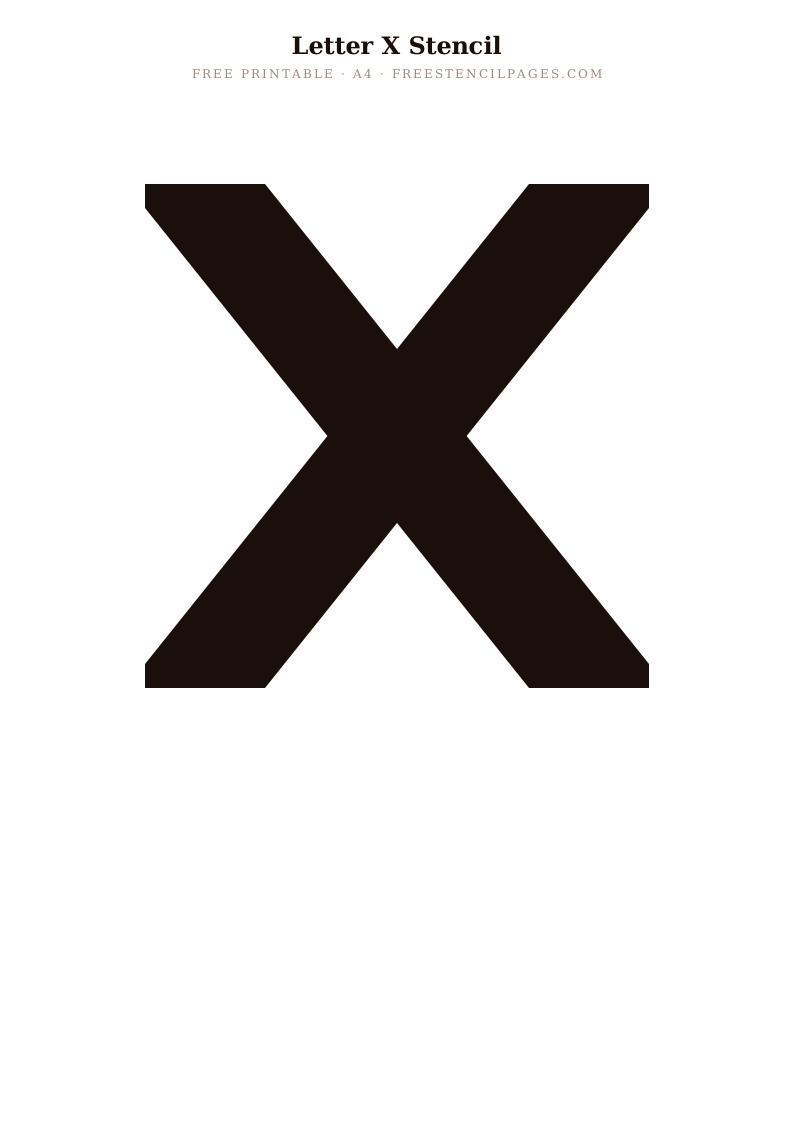
Popular
Letter Y
⬇ Download Free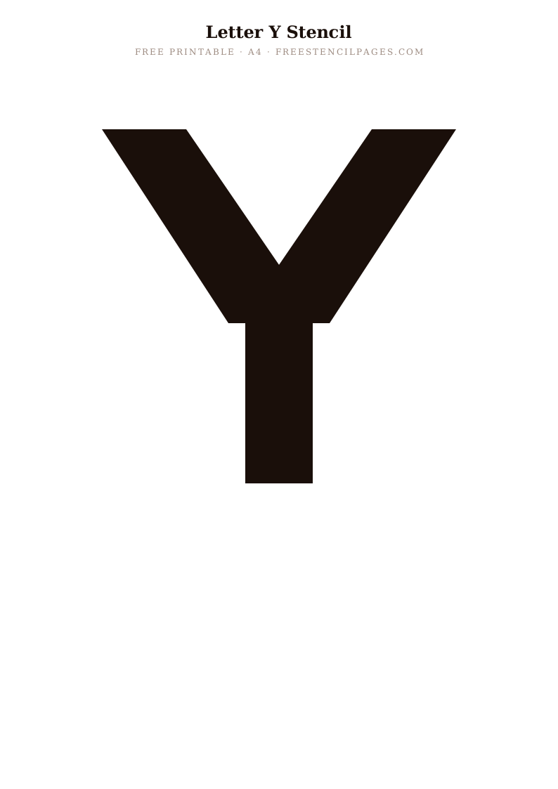
New
Letter Z
⬇ Download Free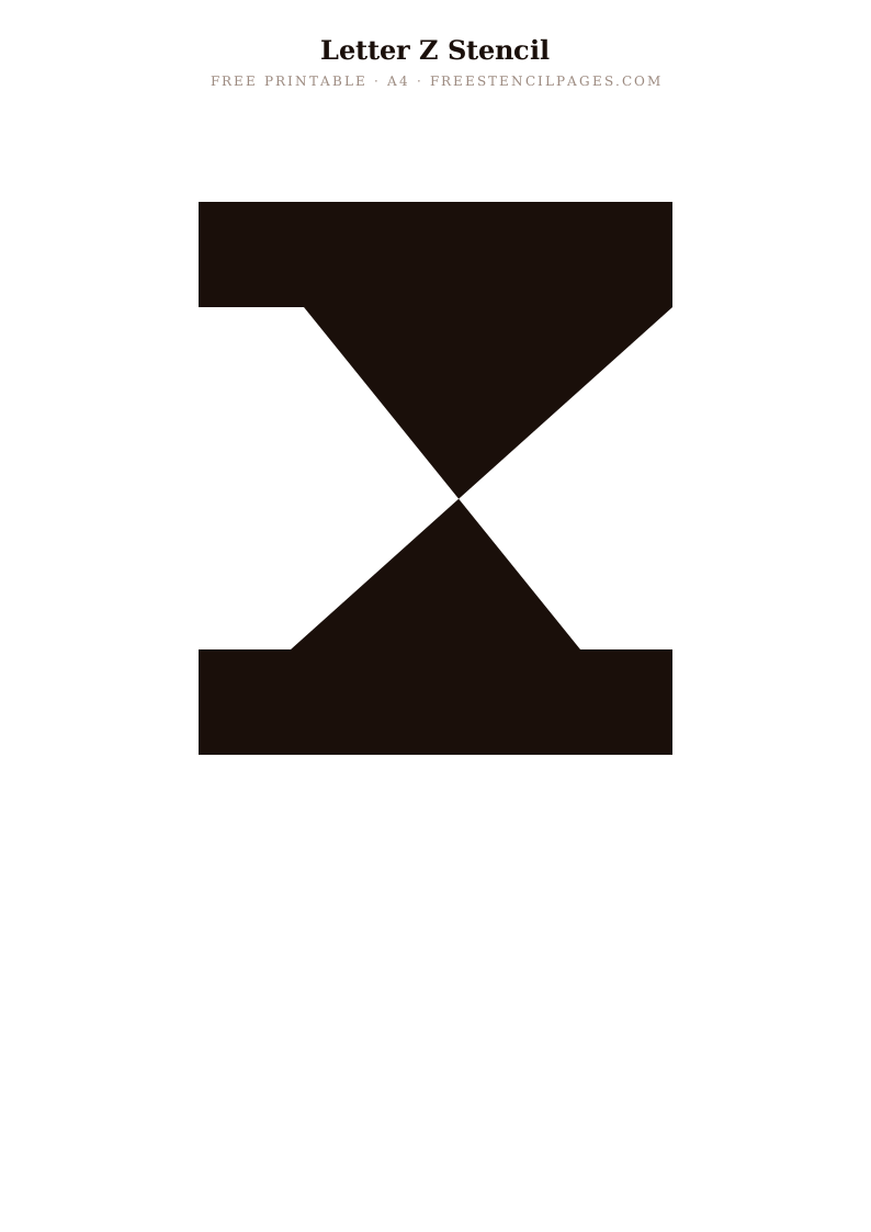
Classic
Number 0
⬇ Download Free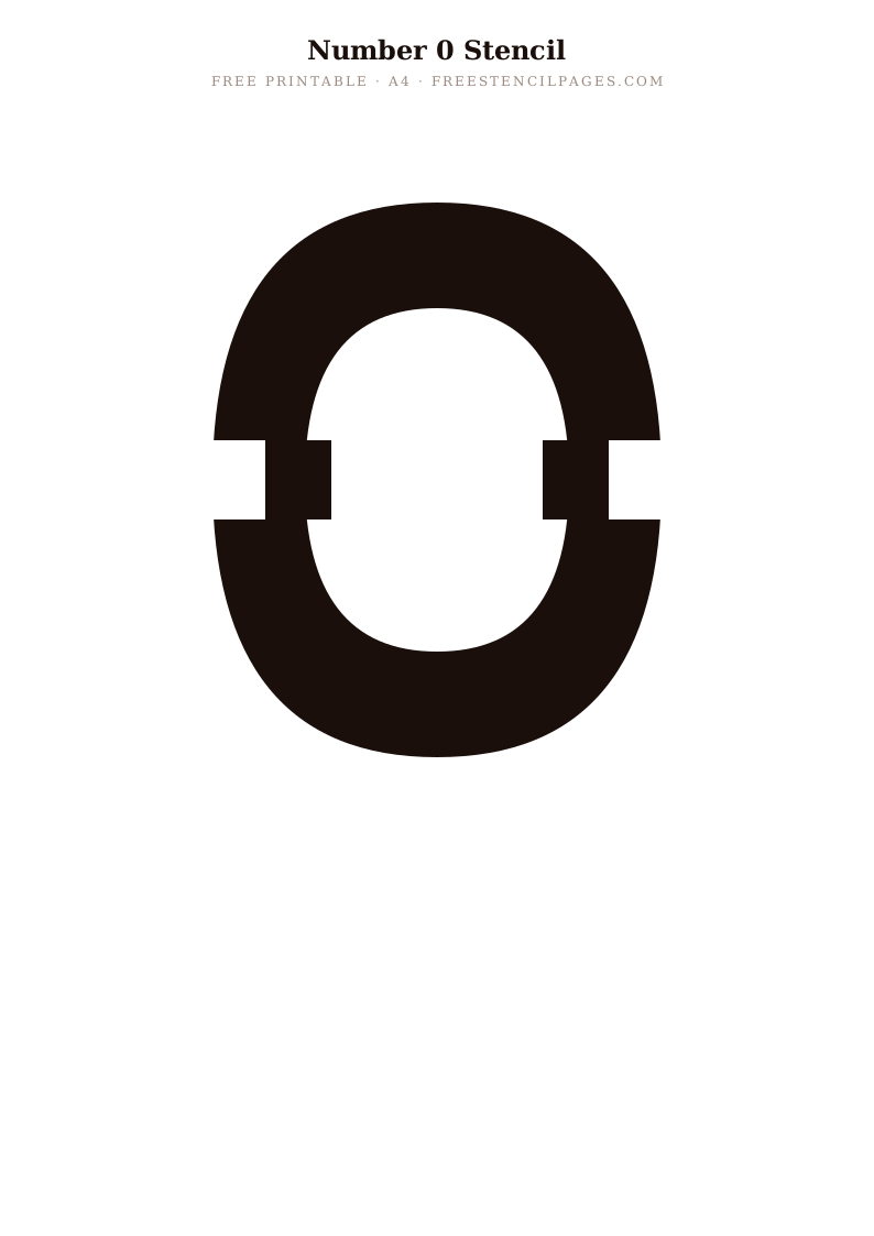
Featured
Number 1
⬇ Download Free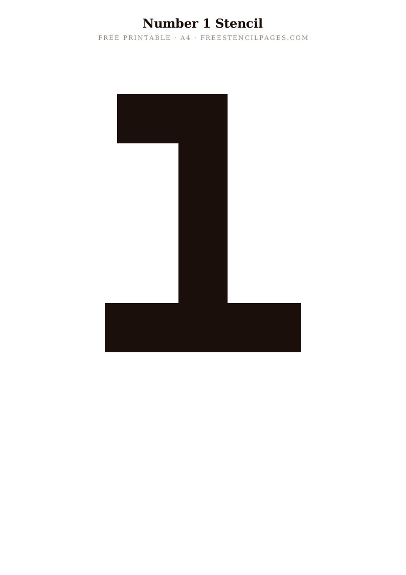
Top Pick
Number 2
⬇ Download Free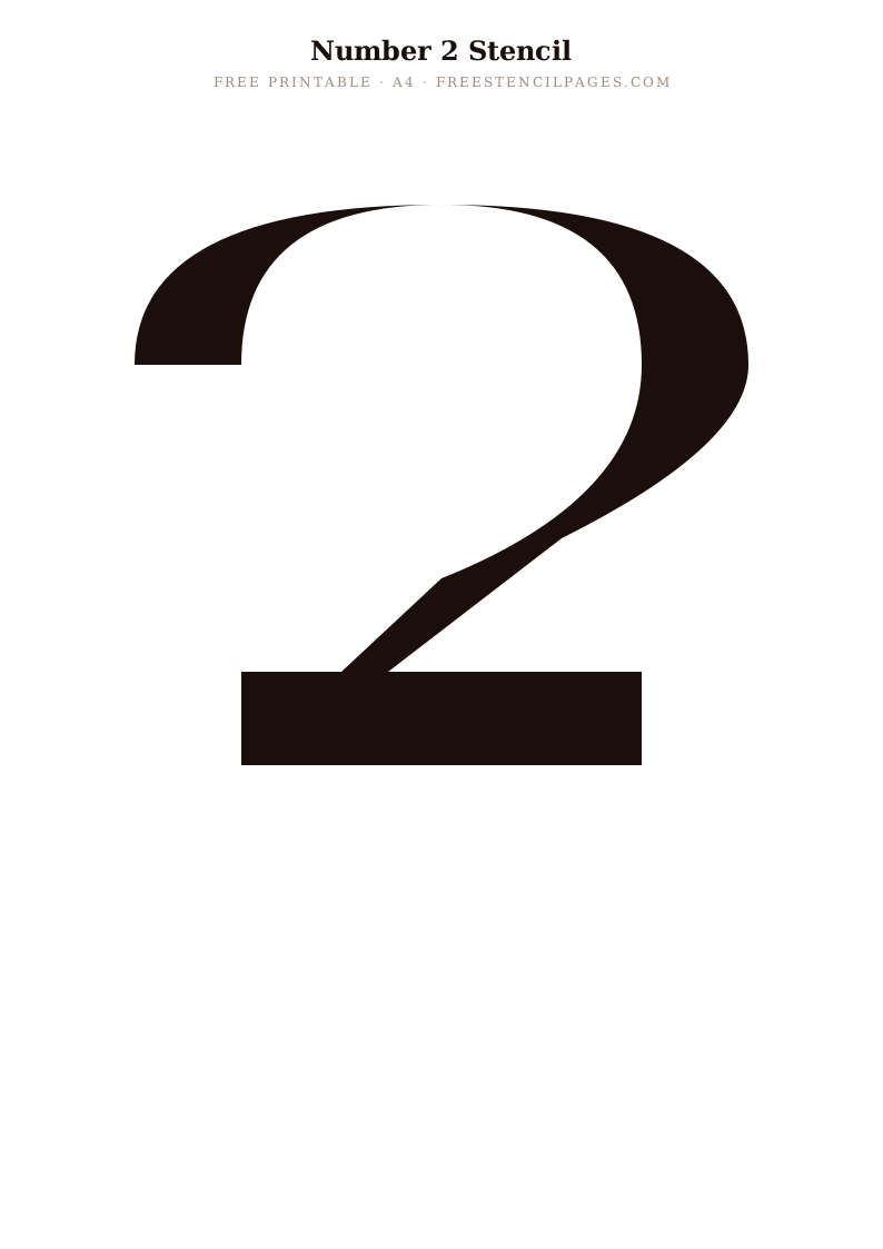
Trending
Number 3
⬇ Download Free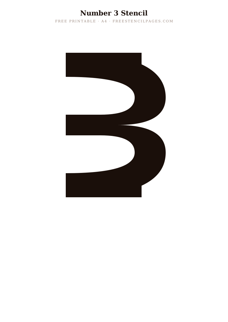
Staff Pick
Number 4
⬇ Download Free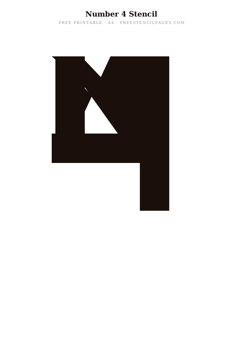
Popular
Number 5
⬇ Download Free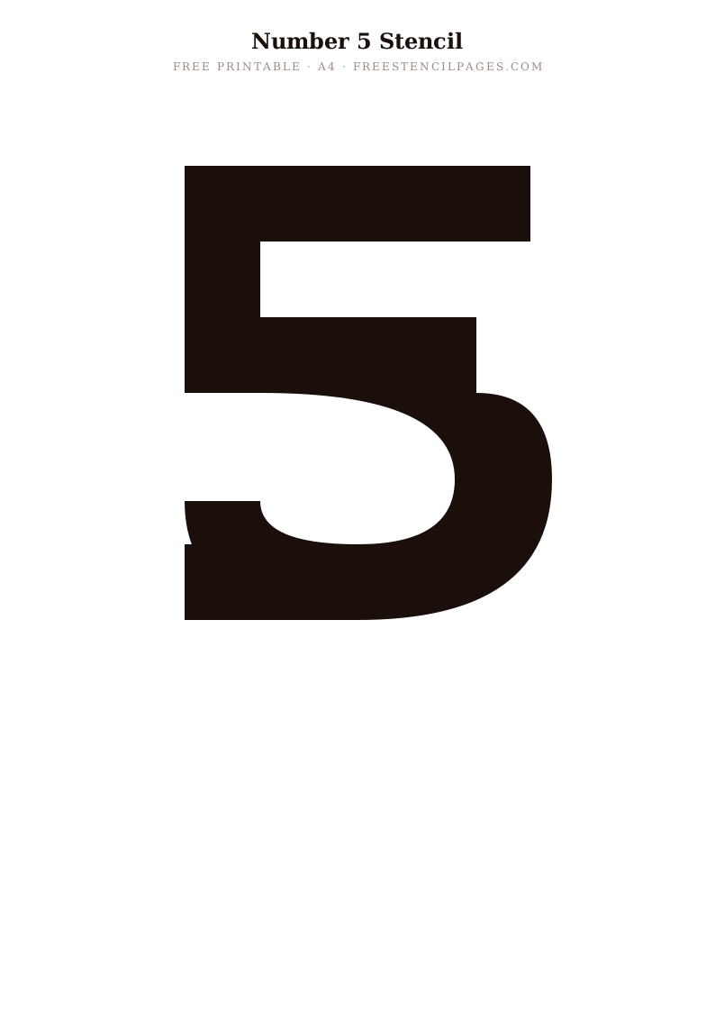
New
Number 6
⬇ Download Free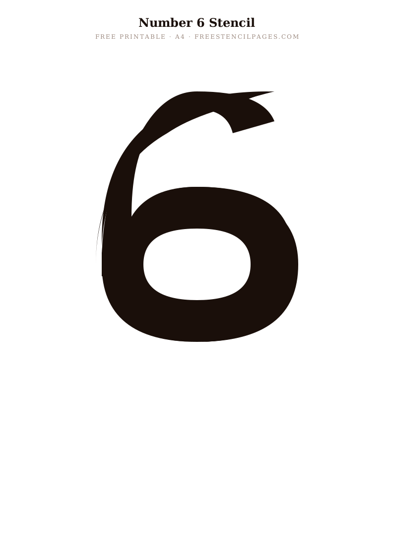
Classic
Number 7
⬇ Download Free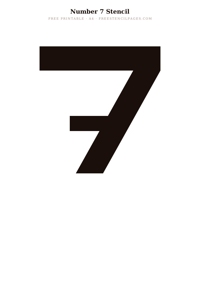
Trending
Number 8
⬇ Download Free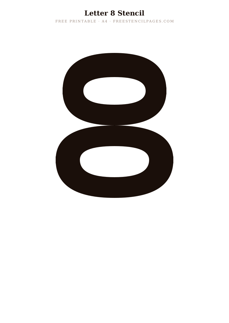
Featured
Number 9
⬇ Download Free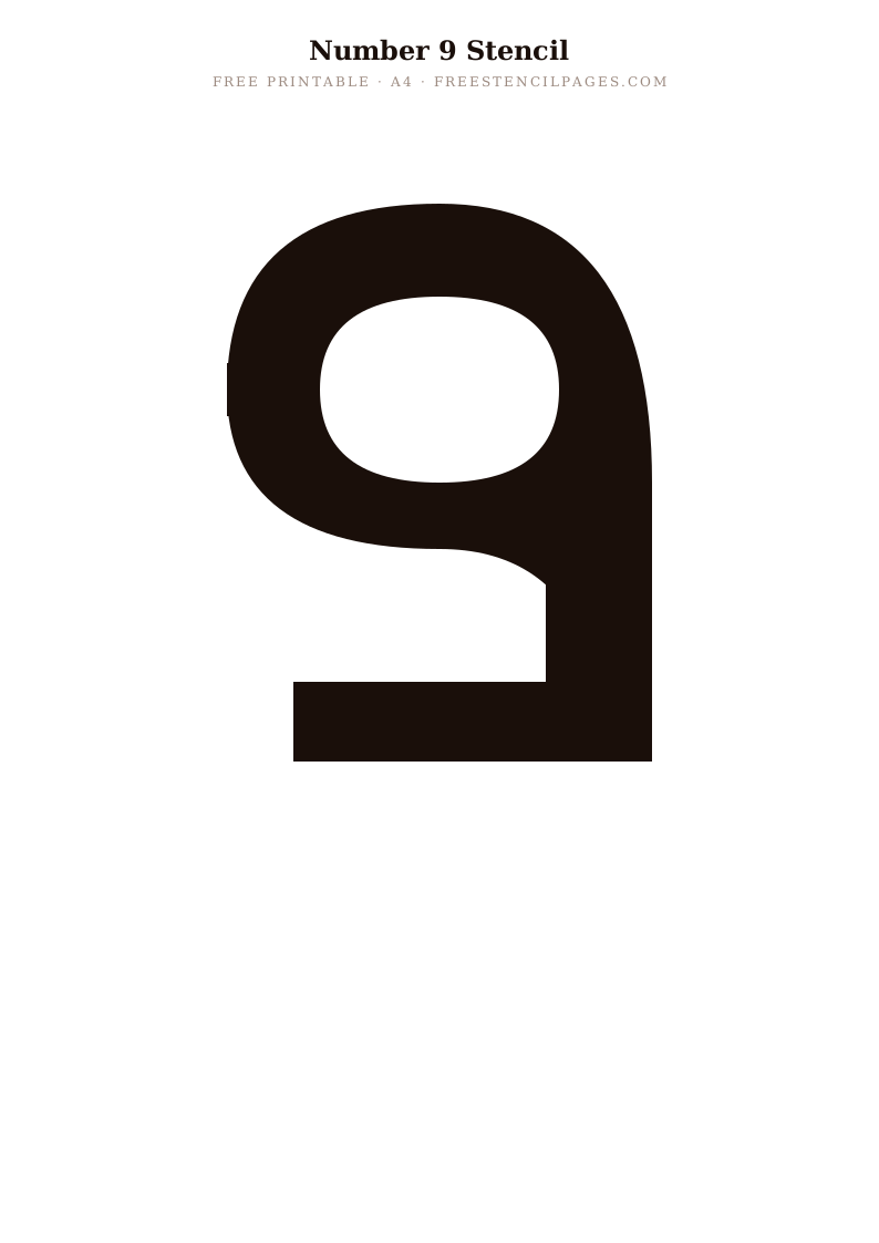
What size should your letters be?
The most common letter-stencil mistake is printing first and measuring afterwards. Because each file is a vector SVG, you can scale a letter to almost any height before printing, so it pays to decide the finished size up front. This is a rough guide to get you in the right range:
| Project | Typical letter height | Worth knowing |
|---|---|---|
| Gift tags & cards | 2 to 4 cm | Several letters fit on one A4 sheet, so lay the word out first. |
| Labelled jars & boxes | 3 to 5 cm | Curved surfaces grip better with low-tack tape than spray glue. |
| House & door signs | 6 to 12 cm | One or two letters per sheet. Print at 100%, never "fit to page". |
| Nursery name / shelf | 10 to 18 cm | One letter per sheet. Scale the SVG up before printing. |
| Feature wall / large sign | 20 cm and up | Tile the SVG across several sheets and join, or cut on a machine. |
Spacing letters so words read right
Single letters are easy; words are where projects go wrong. Even spacing between every letter usually looks uneven, because some pairs (like A and V, or T and o) tuck together while others need air. A few things that help:
- Lay the word out before you print. Drop the SVGs into Canva, Word or PowerPoint, type your word in order, and adjust the gaps by eye until it looks balanced.
- Use a pencil baseline. On the surface itself, draw a light, level line (a spirit level helps on walls) and sit every letter on it so nothing drifts up or down.
- Judge word gaps by an "n". The space between two words should be roughly the width of a letter. That is far more than the gap between letters inside a word.
- Cut letters individually for flexibility. Separate single-letter stencils let you nudge spacing as you go, which a fixed one-piece word stencil cannot.
About the bridges (the gaps in A, B, O, P, Q and R)
The small breaks inside enclosed letters are called bridges or ties. They aren't a flaw. They hold the middle of the letter in place so the centre of an "O" or the bowl of a "B" doesn't drop out when the stencil is cut.
Keep them for the recognisable, slightly industrial stencil look that suits crates, workshops and rustic signs. Or paint them in afterwards with a fine brush once the main coat is dry, to fill the gaps and produce a solid, continuous letter. If you are hand-cutting, never trim the bridges away before painting. That is how the counter falls out and tears the design.
Paint and surface pairings
The stencil is only half the job. Matching paint to surface is what keeps edges crisp.
Wood & MDF signs
Chalk paint or acrylic with a stiff stencil brush. Seal with wax or matt varnish once dry.
Walls
A tester pot of emulsion goes a long way. Low-tack spray adhesive holds the stencil flat; a spirit level keeps the line true.
Fabric (totes & tees)
Fabric paint, with card slipped inside so it cannot bleed through. Heat-set with an iron per the paint's instructions.
Glass & ceramic
Enamel or a dedicated multi-surface paint, cured as directed so it survives washing.
Paper & cards
An ink pad or a little acrylic, dabbed lightly. Thin paper shows bleed fastest, so go easy.
Five mistakes that ruin letter stencils, and how to fix them
- Too much paint. Overloading the brush forces paint under the edges. Offload most of it onto kitchen roll first, then build colour up in light coats.
- Brushing instead of dabbing. Dragging a brush pushes paint sideways under the stencil. Pounce straight up and down instead.
- Printing at "fit to page". This silently resizes your letters, so pairs no longer match. Always print at 100% / actual size.
- Lifting the stencil too late. Fully dried paint pulls and chips on removal. Peel while the paint is just tacky.
- Thin paper for repeat use. Bridges tear after a couple of uses. Print onto 160 to 200gsm card, or laminate for a wipe-clean stencil that lasts.
Project Ideas
House & Garden Signs
Print letters at A4 size and use on painted wood or slate for professional-looking house signs and garden plaques.
Nursery Name Wall
Arrange the first letter of a child's name as a large feature on a nursery wall using chalk paint or decal vinyl.
Personalised Gifts
Use letter stencils on wooden boxes, chopping boards, glasses and mugs for unique personalised gifts.
School Displays
Print letters in multiple colours for classroom displays, name labels and educational activities — free for educational use.
Vinyl Cutting
Import the SVG letters into Cricut Design Space to cut adhesive vinyl monograms for walls, laptops and water bottles.
Party Props & Banners
Cut letters from card to create personalised name banners and party props for birthdays and celebrations.
Tips for Letter Stencil Projects
- Spacing letters evenly: Before painting, lay out all the letters you need on paper and measure the total width. Find the centre and work outwards from the middle letter to ensure balanced, even spacing.
- Keeping letters level: Use a spirit level and pencil to mark a baseline on your surface before you start. Remove the pencil mark after the paint has dried with a slightly damp cloth.
- Multiple-use tip: For words you'll use more than once, print each letter individually on card and laminate. Store in alphabetical order in a ziplock bag for repeated use.
- Composing in digital tools: Import multiple SVG letters into Canva, Illustrator or Inkscape to compose whole words or phrases before printing — then print the whole word on one or more A4 sheets.
Curated Collections
Frequently Asked Questions
Are all letters of the alphabet available?
The full A to Z alphabet is available, plus the digits 0 to 9, each as its own A4 file. Download just the letters you need, or the whole set. Every letter includes built-in stencil bridges so the centres hold when you cut.
Can I resize the letter stencils to any size?
Yes — as SVG files, the letters scale perfectly to any size without pixelating. Use them at 2cm for gift tags or at 60cm for large signage.
What font style are these letter stencils?
Our current alphabet uses a classic serif style — clean, elegant and widely readable. It suits farmhouse, traditional and formal design styles.
Can I use these letter stencils commercially?
Personal and educational use is free. Commercial use requires a licence — please see our licence page for details and pricing.
Can I make whole words, or just single letters?
Each download is a single letter. To build a word, drop the SVGs into Canva, Word or PowerPoint, line them up in order and print. If you are hand-cutting, it is usually easier to cut each letter on its own sheet and dry-lay the word before painting.
Why are there little gaps in letters like A, O and R?
Those gaps are bridges (ties). They hold the centre of an enclosed letter in place so it does not fall out when you cut the stencil. Leave them for the classic look, or paint them in afterwards with a fine brush for a solid letter.